
We’re finally back INSIDE Magic Kingdom for the first time since March!
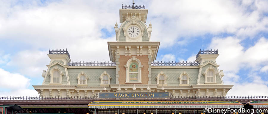
Magic Kingdom
And while we got to check in on Cinderella Castle’s makeover progress during our stay at Disney’s Contemporary Resort a few weeks ago, we got to see the (almost) finished goods today!
Just for reference, here’s what Cinderella Castle looked like before she underwent her royal makeover.
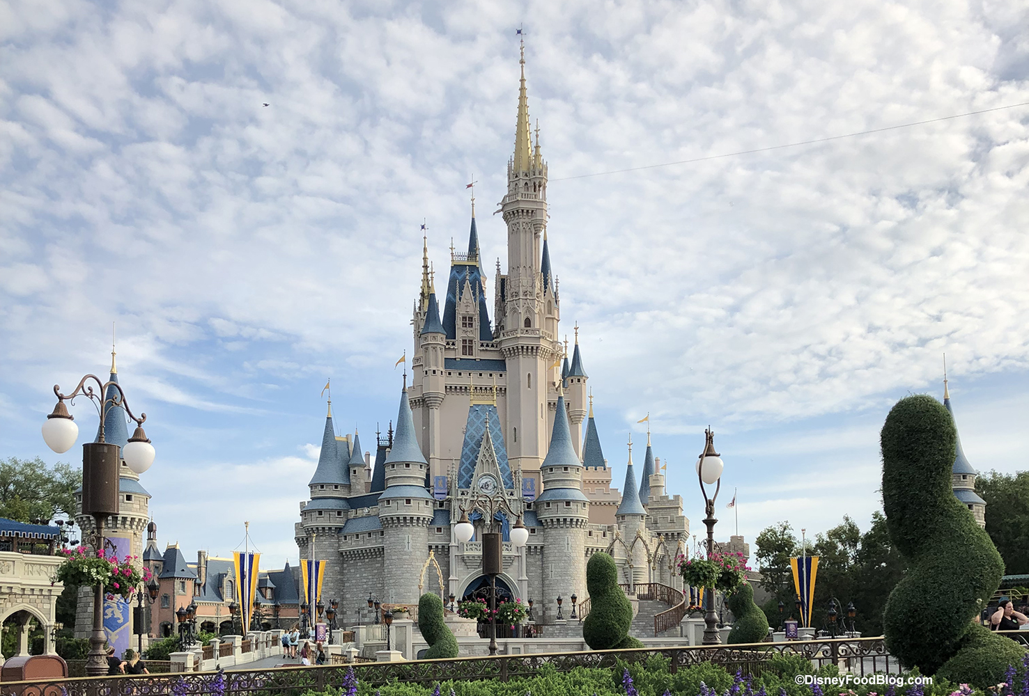
Cinderella Castle
And just like that, it appears Cinderella Castle’s refurbishment is just getting a few final touches!
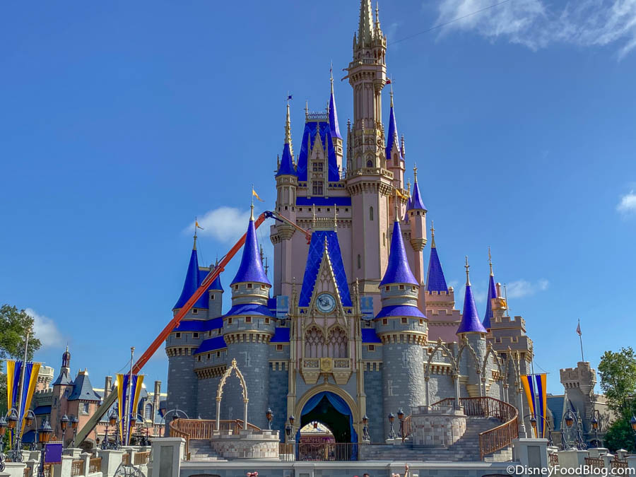
Cinderella Castle
With Magic Kingdom’s 50th-anniversary coming up, Disney World wanted its iconic centerpiece to look her absolute best! We learned Cinderella Castle would be receiving a royal makeover back in February, and that its paint job would entail a new rosy-pinkish hue! Here’s the artists’ concept they shared with us at the beginning of the year.
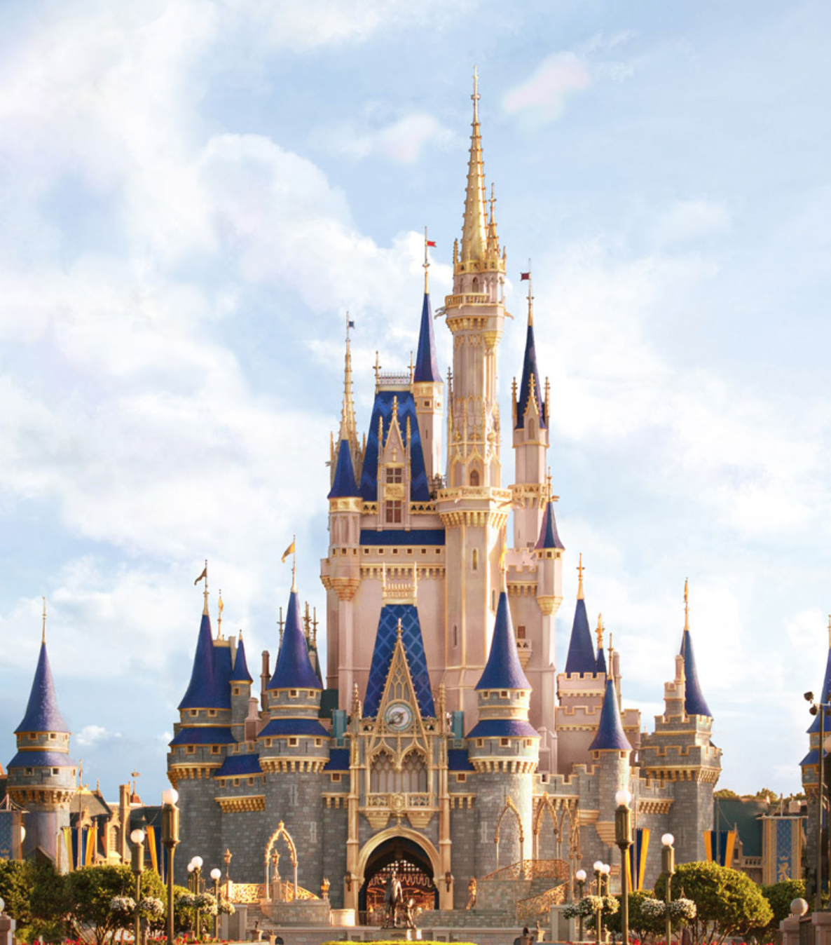
©Disney Artist Concept for New Cinderella Castle
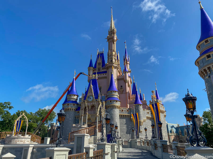
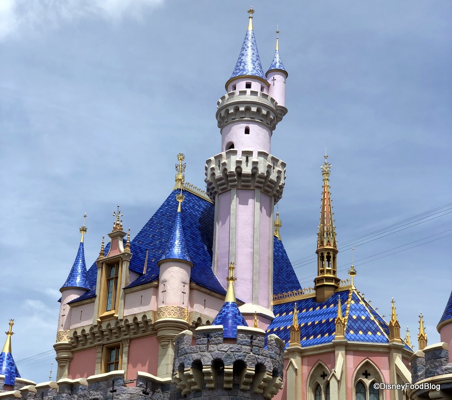
We weren’t really envisioning such a bright shade of PINK as what we saw in person today! The renderings made Cinderella Castle’s new pink look a bit softer with a muted blushy pinkish tone. But in person, the pink is more of a salmon color and it’s pretty vibrant!
Cinderella Castle
The lower half of the castle will remain its former grayish color while all of Cindy Castle’s architectural features have been turned to gold.

Cinderella Castle
Even the spires have received a much deeper, bolder blue hue than we were expecting! Don’t get us wrong — the colors are really visually striking, but it’s going to take us a little time to process our thoughts on such a different-looking castle! The deeper blue really sticks out against the sky now!

Cinderella Castle
For now, the cranes are still up. We will continue to keep you posted on the progress of the castle as the finishing touches are completed. So, stay tuned for more details!!
We’re reporting LIVE from Magic Kingdom today. Follow along with us here!
Disney Park Reopening Details and Info
Click HERE for the All Latest Updates
Click HERE To See FULL LISTS of the Rides, Attractions, Shopping, Entertainment, and Restaurants Opening in Disney World!
TUTORIAL: How To Use Disney World's NEW Park Pass Reservation System
ALL Disney World Reopening Procedures
Disney World Hotel and Ticket Booking Information
We’re Visiting ALL the Reopened Disney World Hotels and Have All the Need-to-Know Details
We’re LIVE in Disney World's Magic Kingdom For the FIRST Time Since the Closures
We’re LIVE in Disney’s Animal Kingdom For the FIRST Time Since the Closures
We Got a FIRST LOOK at Disney World’s New Character Cavalcades and Entertainment!
Everything You NEED To Know About Wearing Masks in Disney World
Join the DFB Newsletter To get all the latest Disney Park Closure News Delivered Right to Your Inbox Click here to Subscribe
What do you think of Cinderella Castle now that its royal makeover is finished? Let us know if you’re a fan of the new paint job (or not!) in the comments below!


 Our handy (and portable!) ebook guides make sure you get the best deals and can plan a vacation of a lifetime.
Can you post a picture of the back of the castle please?
I dont think the castle looks that bad. It’ll grow on us over time. Thank you for the pictures!
I really love the deeper blue and gold, but I’m not so sure about the pink … I loved the artistic rendering, but it doesn’t seem to translate well in pictures. Guess I’ll have to wait to see it in person!
The concept art or the castle redo was so beautiful! But, the actual finished product has the blue with WAAAY too much purple in it, making it look cheap! I love the gold, but I really hope they can repaint the intense blue with a color that more accurately matches the concept art. If I had a Disney Wedding right now I would be so disappointed that my pictures would have to have the castle looking so tacky when it could have looked lovely.
Ok, TBH, it’s not as bad as I feared! I like the bolder blue color too.
What prompted the Salmon Color? I know Disney did the same at Disneyland. I have not read anywhere, how or why the color change. Are they trying to address a PC thing? In any event, so long as it is not a B-Day Castle. I’m sure I will be accepting of the change.
I bet it was nice to be back.
Looks like they changed their mind on the blue shade. Little too bright for me. Will take some getting used to.
I think it looks pretty! Plus it will show up better in our future castle pics. It looks fresh and vibrant!
I think it’s beautiful. At least it’s not as bad as the inflated birthday cake they did for the 25th Anniversary in 1997.
Hate it!!! I love the white castle. It made it look like a real castle. This castle looks like a unicorn threw up on it. So sad.
I Don’t like the changes at all! Why did they change the classic style? Cinderella’s castle is supposed to be blue, white and silver. I don’t like the Gold, Pink, or the Purple/blue. It looks too much like the Sleeping Beauty castle in Disneyland.
it would’ve looked SO much nicer if they followed the artist’s rendering and used more muted hues 🙁
Maybe they need to account for the paint getting weathered in the long run? I’m just sad I’ve never seen it in person with its original iconic colors
It was elegant. Now it’s not.
I think the castle looks too much like Sleeping Beauty’s. I’m really sad. It looks garish.
I thought the passholder viewings was July 9th and 10th? So lucky!
I actually LOVE it! The Blue and the Gold really stand out and although pink is not my favorite color, I can deal with it as long as the rest of the castle stays the grayish color.
I’ll take anything over the HIDEOUS birthday cake!
Nikki, the Passholder previews are the 9th and 10th; this was a cast member preview, and a friend brought us along!
I’m sorry guys, i tried to like it. I tried to look at the whole ‘freshen things up’ point of view. But, the castle is the one thing, of all other parts of the entire WDW Resort that I just feel never needed a change. Disney please stop making changes! Wait till I’m dead! I only have about 20 a 30 years left if I’m lucky..
I kinda like it? I like the pink a lot. It’s much more muted than I feared it would be, and I think the two tone paint job makes the architectural elements on the second level of the castle stand out more as they all kinda blended together when it was all one color. It kinda reminds me of the castle at Disneyland Paris now, which is beautiful. The gold accents are also very pretty. The only dud for me is the bright blue roofing. I wish they had chosen a darker or less saturated shade of blue, because it looks kinda garish next to the pale salmon and gray. That said, I’m sure that color will fade under Florida’s hot sun, so I’m open to the idea that the blue roofing will improve with time.
It’s no longer Cinderella’s castle, and it looks like all the Disneyland castles. I hope it’s not permanent.
What in pepto… this pink is ugly it looks to mauve not pink. Why you gotta diss cinderellaa on her 70th. Let’s toss her from the tower …yet another aurora castle if i wanna see aurora castle ill got to disney land. Cinderella is blue silver and white. You ruined it. Change it back… i pray it sun bleaches quick. Because this is ugly. To much pink and gold at least the artists rendering looked cute this actual job is an eyesore
I hate it too..!
Full on tacky! Even my dad didn’t like it… And he doesn’t care about that kind of thing much. I seriously hope they change their mind… The only parts I like are the gold trim and the gray… They seem to be doing some multiple shades of gray which I think is a really good idea and the gold is beautiful other than that… Total fail!
I’m actually surprised how much this feels like a close second to a dealbreaker for me. Anyone know how to give Disney feedback directly?
I’m sad that WDW has developed this mindset lately that everything has to be changed. I hate it. Sorry, but it’s ugly. It was beautiful like it was. That is not Cinderella’s castle anymore.
The blue is way too dar and doesn’t look elegant. It makes me sad… some things should stay classic.
The castle is Goudy now and nothing close to being royal . Walt wouldn’t like this at all. Best we can hope for is the Calif sunshine fades this paint to be softer and not so bold